ReportReportReportReportReportReportReportReportReport


Girl’s Not Grey | A Study in Graphite
Article / 17 April 2025
A few months ago, I started a new habit. Initially, it was just a fun idea that gave me an excuse to draw every day. It didn’t take long for it to become so much more.
WHAT’S IN MY BAG?
For my journey, I wanted to pack a very limited set of tools. I didn’t splurge, choosing to earn the right to better supplies after using this first batch to the fullest. Here is what I’m currently working with:
- Basic 8 X 8 Square Sketchbook
- Set of 14 Graphite Pencils (4H, 3H, 2H, H, F, HB, B, 2B, 3B, 4B, 6B, 8B, 10B, 12B)
- Set of White Graphite Pencils
- Eraser
- Pencil Sharpener
- Set of 12 Grayscale Markers
START HERE
I began by learning about my materials – studying the basics of both graphite and alcohol markers. After a bit of experimentation, I was ready to test my mettle with Expert Mode.
Graphite Scale
H = Hard | F = Fine Point | B = Black

Shading with Graphite
When shading with the pencil tip, the lead can reach more of the paper texture crevices. When shading with the pencil on its side, the lead does not reach all of the paper texture crevices, allowing more of the paper color to show through. Using a combination of the 2 techniques is often necessary to achieve full opacity, but many artists leverage this knowledge to create highly textured pieces – using the paper color exposure to their advantage.

EXPERT MODE: SHADING
EXERCISE 1: Value Scale
This first exercise was a surprise and taught a valuable lesson: how to work with handicaps. Each sheet of paper has a unique texture and there are even some areas of the same sheet that behave differently. Rather than focusing too hard on getting it right, I zeroed in on adjusting my pencil pressure and working with the grain. It was a true “first attempt” where I allowed plenty of room for failure (note that the value scale is not in order).

EXERCISE 2: Dark to Light, Light to Dark
This 2-box exercise was considerably easier than the first, in spite of the visual complexity. I experimented with a variety of grips on the pencil and found that certain positions offer better support with cleaner results. Rotating my book and layering were also key to achieving this outcome and I began to adopt these techniques for the remaining exercises.
EXERCISE 3: Cylinder Gradient
After exploring the previous gradients, I felt more confident with the approach and zoomed right through Exercise 3.
EXERCISE 4: Triangle Split Gradient
The aspect I found most interesting in this exercise was maintaining a sharp diagonal line that clearly defines the 2 triangles. This was also the first example where the shapes touched and needed to perfectly balance one another.

EXERCISE 5: Inset Boxes Gradient
Aside from the initial adjustment of Exercise 1, I found Exercise 5 to be the most challenging. The outer box frame was filled in first, focusing on mirroring the 2 sides. The inner square was next, followed by the final box, which was a reprieve in terms of difficulty. I didn’t cut corners by lightly shading the entire form then darkening per the gradient. I took my time and worked with each section, slowly layering to reach the right opacity.
EXERCISE 6: Sphere-In-Box Gradient
The pièce de résistance was Exercise 6. I appreciated the changeup in object shape, forcing me to think differently about the placement of the shadow and maintain a consistent round appearance. Finishing to this level of quality was a triumph and I am so proud of my results!

TIPS
- Both lead and paper have imperfections. Learn them and work with them. Use a “rub buffer” (a sheet of paper) to prevent unintentional smearing.
- Test a variety of grip postures. Loosen your wrist, move with your shoulder, hold the pencil further from the tip – there are so many possibilities!
- Have patience. Develop steady layering and trust the process.
- Limitations enable creativity and provide a new way to think and work. By focusing on grayscale, I’ve enhanced my color-perception when returning to projects with the full color spectrum.
- Discover a new talent - start small, explore big!
- Practice "week-daily". Break up exercises with “Free Draw Sessions”.
- Keep it to yourself! There’s no need to share. Think of your sketchbook as your workbook – a catalog of things you’ve tried, documenting and keeping track of materials and techniques.
- Don’t forget to STRETCH!!!
PUT ‘EM TOGETHER AND WHAT HAVE YOU GOT?
Through my creative exploration, I have fallen in love with grayscale! The pieces below are a few of my “Free Draw Sessions” and I thoroughly enjoyed making them.


RESOURCES
Decision Point | Art in the Making
Article / 07 May 2024
This quick blog is a behind-the-scenes peek at art creation, detailing the step-by-step decision making from basic to complex.

WHEN TO MAKE A CHOICE
“Thought Bubbles” is what I term a “quick comic” – a short-term (1 - 2 day) project that simply illustrates an idea and is meant to be less coiffed than a full-scale piece of art.
- DECISION POINT: ART DIRECTION
With this particular concept, I wanted to convey things with geometric, mismatched thickness, and sketchy strokes.
- DECISION POINT: ART STYLE
The sketch became the lineart, but I still couldn’t allow myself to release a project that felt so unpolished. I knew that I would return back to this part of the process prior to finalizing.
- DECISION POINT: LINEWORK QUALITY
After laying down the initial outline, I began filling with flat colors just to get an understanding of the possible final outcome. This forced me to then make another style decision – how 2D should this art be? To test, I added both a highlight and a shadow to the brain. Although subtle, it made him stand out against the remaining elements and forced this comic into more of a 3D world, which is not what I was aiming for. I opted to create either a highlight or a shadow on each object in the scene. Sometimes a limitation can open up a world of creativity!
- DECISION POINT: COLOR EXPRESSION


Brain - Highlight Only
Once the fill was complete, I went back in and cleaned up some of the linework from the original sketch. It was important that the main characters have a stronger outline so that they remained the focal points.
- DECISION POINT: LINEWORK EXPRESSION

ORIGINAL Linework

Final Linework

Final Before Linework Re-Touch

Final After Linework Re-Touch
Now it was time for my final touches - save the project, take time away, then scrutinize via another device (typically mobile). This “fresh set of eyes” allows me to make changes and spot any fine detail inconsistencies.
- DECISION POINT: FINAL TOUCHES / QUALITY CHECK
OPEN UP!
I would love to learn more about other artists’ processes so please share your thoughts!
Are you faced with the same decisions?
Do you have alternate methods for your work?
Foxed | A Side Story
Article / 02 May 2024
A LITTLE ADVENTURE
While visiting my local used bookstore last week, I found a treasure that I just couldn’t leave behind - a glossy, full color architecture and design hardback aimed toward artists. After poring over the pages for a few minutes, I detected a slight smell and noticed a faint rusty color on the closed edges. I asked a nearby employee about my observations. She politely accepted my request to double check the scent and gave her expert advice that there was no mold or mildew – merely just a light “foxing,” probably brought on by years of direct sunlight, dryness, and possible neglect. I had never heard the term before and it inspired me to do a bit of research, as well as create a fun art piece.

WHAT IS “FOXING”?
“Foxing” is an age-related process of deterioration that causes spots and browning on paper documents such as books, postage stamps, paper money, and certificates. The name is derived from the fox-like reddish-brown color of the stains, or the rust chemical (F)erric (Ox)ide which may be involved. Paper so affected is said to be "foxed".
HOW TO TREAT “FOXING”
Lucky for me, my book was gently afflicted by this process. I found a treatment where I could seal the book in plastic bags and put it in the freezer for 48 hours, allowing the germs (and actually the smell) to die off.
Below is an excerpt from that guidance:
The other technique that will kill all germs is freezing your books. It won’t hurt the books and most germs will die off in hours, leaving them in the freezer for 48 hours will certainly wipe them out. This method will also annihilate more persistent critters and things like mold and mildew. When I use this technique, I put the books in plastic bags or wrap in plastic wrap, then put them in the freezer.
FIXED OR “FOXED”?
Here is a photo of the latest addition to my collection. Time will tell if it is truly rehabilitated, but for now I am happy to dive into its rich pages and explore new horizons with my art.


I hope you enjoyed this short blog and learned a few things about a topic that – until recently - was completely new to me.
HELP US OUT!
Are you a paper expert?
Have you dealt with restoration of books, stamps, paper, or art?
OWN IT | SHARE IT!
Do you know any bibliophiles that would love to own a copy of “Foxed”?
Could your local library use a poster of this work?
Check out my ArtStation Gallery and pick up a print today: https://www.artstation.com/prints/art_poster/x47A2/foxed.
My First YouTube Video | "A Simple Cup" Blender Tutorial
Tutorial / 26 August 2023
I’ve noticed a trend while working with Blender over the past 6+ months. Once an artist learns enough to be dangerous, they are eager to bring those lessons back to the community. It's exciting to form something amazing – something that has never been seen before - using solely your imagination, keyboard, and mouse. Tutorials, blogs, and posts all over the internet can attest to this contagious passionate energy.
I’m proud to now consider myself “dangerous” and join the ranks by making my first YouTube video. For me, this is a plunge into a whole new world – not just with a new program, but with an entire arsenal of fresh skills. I look forward to enabling and cheering on others in Blender, hoping to unlock more potential in the creative universe. Let’s get Blendin’!
A Simple Cup in 10 Easy Steps

Tell Me!
What do you think of my tips and process?
Show Me!
Have you made “a simple cup” in Blender? Share it with me - I’d love to see it!
Just a Dash | Line Thickness & Why It Matters
Article / 19 June 2023
The Difference Between Amateur and Professional
Knowing when to use a certain style or size comes with experience and observation
- Example: A Comic Artist’s pencil sketches translated into ink

Why It Matters
More Expressive Linework = More Expressive Art
- Varied line thickness creates visual interest and emotion
- Can provide context clues or create foreshadowing in a scene
- At its worst, it can also change the way a piece is interpreted or be a distraction from the main focus
How to Choose The “Right” Line Thickness for Your Project
YOU are the author so you are always in charge of your own work, but a bit of planning can go a long way to help the reader fully understand your idea
- Try a few unique approaches before settling on the final design
3 Questions to Ask Before Logging the First Stroke
- What are you trying to convey?What is the message, mood, and/or style?
- Who is the audience?Who are you communicating with through this piece?
- What are the proportions?Is your linework proportionate to the overall image size?
Line Techniques
Hashing, Cross-Hatching, Dashes, Dots, etc.
- Where You See It: Comic, Manga, Sketch
Tapered (Thick-to-Thin)
- Where You See It: Caricature, Comic, Cartoon, Illustration
Bold (Thick, Thick, THICK)
- Where You See It: Graphic Design, Advertisement
“Shaky”, Textured, Consistent Thickness
- Where You See It: Indie, Comic Strip, Cartoon, Sketch
Thick Outer Border
- Where You See It: Cartoon, Illustration
The absence of a hard edge is also appropriate in some cases!
- Where You See It: “Cut Paper”, 3D, Painting, Mixed Media
Join The Discussion!
Have you seen examples where line thickness really mattered?
What are some cool ways you’ve worked with lines in your art?
What I'm Into | Products & Resources I Use Every Day
Article / 01 December 2022
Good Investments
These investments have proven themselves time and time again. I highly recommend them to other artists. They are all currently available on Amazon.com and I’ve included a precise description as well as the price point to aid your search.
Digital Notepad: LCD All Screen Writing Tablet 13.5" ($20)
- Captures ideas around the clock to be transferred to a more permanent location
- Opportunity to lock the canvas so that notes cannot be erased
- Unlock the pad and erase for a durable, paperless solution
- Pro Tip: Keep this near your bed for quick evening thoughts and a refresher in the morning!

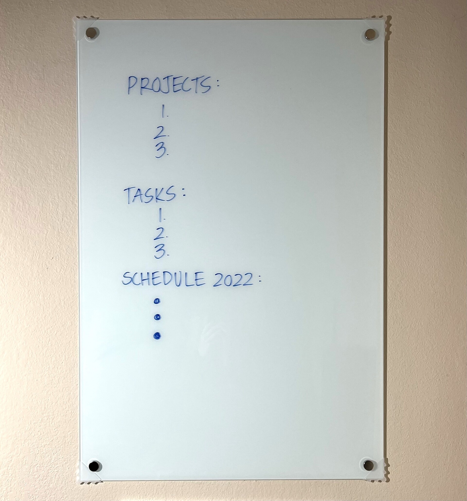
Office Dry Erase Board: Glass Magnetic Whiteboard 3' X 2' ($69)
- Tracks schedules, reminders, and important projects on the horizon
- Perfect size for a corner or small workspace
- Includes markers, eraser, magnets, and installation hardware
LED Lamp: 2-in-1 Floor & Desk ($50)
- Lightweight, height adjustable and can be converted to either a floor or desk model
- Gooseneck for further modifications
- Ergonomic touch buttons
- Multiple light settings with memory of previous selection
- I’ve owned this lamp for over 2 years, and I cannot imagine my setup without it!

Free to Use
Notepad ++: notepad-plus-plus.org
- Simple program with versatile style choices to suit more customized needs
- Quickly spin up new documents and maintain organized workflow
- Updates periodically with clear developer change logs to always know what’s new
"ArtStation Assistants"
These 3 websites are instrumental in converting and sizing files/gifs to meet upload parameters. They are all free to use and I leverage them daily. I call them "ArtStation Assistants".
File Converter: cloudconvert.com
- Fast and easy conversion of a wide variety of file extensions
- Go from “filetype A”to “filetype B” in a matter of seconds
Photo Compression: imagecompressor.com
- Compress image files for individual posting or combine for a gif, small enough to meet site upload requirements
- Work in bulk, “drag and drop” up to 20 photos per batch
Gif Maker: ezgif.com/maker
- Create short videos to display “WIP” (Work in Progress)
- Many customization options, including Text to watermark your work or add notation
Book Recommendations
Art Inc. by Lisa Congdon
Written in an encouraging tone, Lisa is a non-traditional artist who shares her personal experiences and concrete tips for individual application. Each section interviews other successful creators and asks pointed questions about how they reached their goals. Even if you’re further along in your journey, it’s always interesting to “sanity check” your logic and look for new innovative growth possibilities.

Reference Materials
Although you can find nearly everything online, I strongly believe in harboring a small fleet of reference materials. Flipping through paper images can not only inspire, but if viewed in a study format (spending minutes soaking in each page), they can also strengthen perception skills and your overall work. Topics that interest you are a wonderful place to start. Here are a handful of general examples: Artists, Architects/Architecture, Animals, Nature, Anatomy/Medical, Graphic Design, Comics, and Children’s Books. I try to keep my own bookcase full, but practical. My most treasured finds are: Leonardo DaVinci, Frank Lloyd Wright, Green Architecture, Succulents, Masters of Deception, and Calligraphy. I also have an extensive Batman collection featuring my favorite illustrators.

Thank you for reading my blog. It’s great to see you! I hope these tips help – please let me know if they do or if you’ve checked out any of my recommendations. I’d also love to hear your “good investments” suggestions. What resources do you use daily?
What's New | Reviving Old Work
Article / 26 September 2022
Exploration of “Wanted”
Recently I decided to revive an old piece of work – taking it from paper to digital. The original concept was drafted in pencil then inked, waiting for color in my Work In Progress bin. I’ve enjoyed bringing it to life, finally becoming exactly what I envisioned.
Before & After


Learnings
Ergonomics
While tracing the original draft, I experienced a lot of wrist and forearm soreness, so I reset my workspace to support ergonomics. As opposed to a typical office environment, there is no “right” way to setup a home studio and helpful recommendations were limited. I employed 3 small changes that have made a world of difference:
- Played with several Wacom angles - finding that the fully upright position worked best for me.
- Added a new desk drawer for the keyboard and mouse, establishing a better typing posture and overall process with allocation for typing and drawing.
- Adjusted the height of my chair and desk.
Digital vs Paper
Digital
- Documents can be closed, and the computer shut down so I am more conscious of my timelines since I may have multiple projects in flight at one time.
- While focusing on a variety of pieces within a given timeframe, other ideas can be “running in the background”, enabling a constant flow of creative activity.
- Rather than spending time reviewing my work and considering next steps, I can actively test new ideas and pivot quickly.
- Digital art is an immersive experience, offering intermittent breaks – between linework and color, resting the body, etc.
Paper
- Work stays on my desk – in front of my face at all times so I gain additional time absorbing it and “braining” on new ideas.
- Often requires clearer planning and a narrower scope to ensure success.
- Natural forced breaks through watercolor workflow – drying paint between layers, etc.
Improvement Opportunities
Because I wanted to stay true to the original, I didn’t add a lot of extra linework but instead focused on what digital colorization could bring to the table. I knew that the elements should invoke a strong Halloween theme, so I took full advantage of my digital toolkit – leveraging opacity, gradients, composite methods, and textures to enhance.

Book Recommendations
Thesaurus
My thesaurus is one my most valued tools and can be exceptionally beneficial for professional writing and naming artwork. I searched high and low for the perfect version - comparing quality, publish date, size, font size, and color – knowing that it would stay with me for years.

Thinkertoys by Michael Michalko
“The brain that doesn’t feed itself eats itself.”
- Gore Vidal (Thinkertoys p. 15)
Thinkertoys is an expansive exercise in creative thinking. I’ve owned my copy for quite a while – back to when I was an entrepreneur of a different venture. It’s not only creatively inspiring, but also offers practical applications as well. Utilizing the author’s cornucopia of solutions, I’ve navigated a few complex life and business situations – including clever ways to move across the country on a tight budget. Michael Michalko has done a wonderful job of gathering and presenting data in a thought-provoking way.

Here is a warmup that I’ve tinkered with over the years (Thinkertoys, p. 20):
Choose a 4-letter word and make sentences from the letters of that word (each beginning with the sequential letter of the initial word).

Example: T-O-Y-S
Toucans Organize Yoyos Speedily
Tigers Only Yell Spanish
Toddlers Own Yellow Sneakers
Sometimes these wacky sentences yield super unique art concepts!
Thank you for tuning in! I’m so glad you could join me on this journey, and I hope that you’ve enjoyed reading. What are some projects you’ve migrated from one medium to another? Do you have any tips for office/studio ergonomics?
My First Blog | A Personal Exploration of Art: from Watercolor to Digital
Article / 01 August 2022
How I Started Watercolor Painting: from Kitchen Counter to In-Home Studio
As a child growing up, I loved to color, draw, and paint. It was a fun, creative outlet. In school I always gravitated toward imaginative assignments or found a way to make them so. It became such a thing for me in elementary and junior high, that I was even commissioned to draft the bubble letters on other students’ project boards!
In 2019, my high-stress career led me to pick up an old watercolor paint set. I painted standing up at my kitchen counter - a set of mirrors in a monochromatic blue that I had sketched out and lined over later in ink. That quick session ignited my passion, and I became obsessed with painting all the time. On my days off, I would paint. For Valentine’s Day, my husband and I painted together! It made me feel whole.
After months of this pattern, I decided to expand my knowledge on the medium I was investing so much time in. I picked up a variety of books from my local bookstore and used them as a guide to progress my learning. I also setup an in-home studio that was tweaked over time to support my basic needs. Continuing to paint, I tested new techniques and subjects – using random household items in my art like crayons, sunflower seeds, cereal box cardboard, old credit cards, rocks, and more to develop my skills.

Watercolor Painting: Challenges & Rewards
- With watercolor painting, there are a few moments that I’ve found to be consistently difficult. But if you trust the process and work with your vision, everything will come together in the end – and often be more rewarding than expected!
- It’s often hard to get started. “How do I put onto paper exactly what’s in my head?” Adding the first stroke can be nerve wrecking - seeing the wet color glistening on the page. It’s just like the dreaded blank page to a writer, and it is completely normal.
- Trying to perfect each detail and shape it into the final product is also challenging. The midway through point is a wonderful opportunity to experiment or pivot. There’s nothing wrong with altering your mental blueprint to explore something new. In fact, I encourage it! For me, this has reaped the most satisfying learnings!
- The finishing touches can be particularly tough to add. It’s a great time to take breaks and reset prior to completing a painting. Personally, it’s generated a lot of fresh ideas or solidified the approach, giving me confidence and comfort.
Watercolor Painting: Levelling Up
- There are two recent projects that have boosted my watercolor skills - The Oracle: Birds of Prey and Deathstroke. Through each, I was able to dial in precise sketching/planning and investigate new ways to incorporate my previous successful experiments to create a more dynamic piece.


How I Started Digital Art: from iPad to Wacom
To kick off my adventures with digital art, I was gifted an iPad. I immediately purchased Procreate and began drawing nearly every day. When I came across something I didn’t understand or found a cool technique I wanted to try, I located tutorials and references to keep me moving forward. There was such a difference in traditional versus digital art and I was addicted to the technicality and precision!
About a year later, I was given more tools to help me excel – a Wacom Intuos Pro and an upgraded computer. I compared many different programs and finally decided on Corel Painter. Since then, I’ve updated once more with a Wacom Cintiq (DTK-2200). It has been a dream to pick up the stylus every day and create art that can now be shared with a wide audience. I couldn’t be more grateful!
Digital Art: Challenges & Rewards
- Using layers is a versatile way to “test drive” digital art. You can always merge later but having the option to try new concepts or rearrange is cleaner and easier with layers.
- I’ve found that saving often and having clear naming conventions makes the digital art process a lot smoother. The system I’ve adopted seamlessly moves projects between my mobile devices and stationary studio, which allows ideas to always be in motion.
- Layer adjusters can really upgrade your piece (“composite method” in Corel Painter or “blend mode” in PhotoShop and Procreate).
- Take advantage of your ability to search for and use references while working.
Digital Art: Levelling Up
- I discovered Corel Painter through a trial with Wacom. My reasons for investing in this program were simple – it has the tools I need and it’s not under a subscription. In working with the product, I have found it to be a bit sparse in support via guides and tutorials. I’ve been forging the way on my own, piecing together any tips I come across to meet my project requirements. It has levelled me up at a rapid pace – the more I create, the more I learn!
Book Recommendations
I read. I cook. I game. I art. Here are three book recommendations that have been invaluable on my journey. I hope that you’ll check them out and they will help you too!
Visual Intelligence by Amy E. Herman
Amy expands horizons and opens your eyes to a whole new world. This novel is not only insightful and full of interesting facts, but also provides a framework to sharpen observation skills, guiding in everyday life and art.

The Watercolor Artist’s Bible by Marylin Scott
Here we explore watercolor in many forms – prepping the canvas, standard paint, masking fluid, wax resist, using salt, recycled materials, painting with a stick, and much more. I had already begun experimenting prior to picking up this book but was excited to learn more about what I was doing and how it affected the final project from an expert point of view. Marylin has it all laid out in a pleasing way and as I reflect on my time working alongside it, I see the sticky flags marking things I wanted to try.

Humongous Book of Cartooning by Christopher Hart
I was in the market for one of those How To’s from the 1990s with example pages full of eyes, noses, mouths, etc. and luckily scored a copy of this gem at Half Price Books. Chris shares his extensive knowledge in the field of cartooning, and I’ve been fortunate to follow along as a workbook of sorts - creating my own unique characters and style based on his instruction.


Thank you for reading my first blog! I look forward to connecting with other artists and perhaps this brief deep dive into my experiences will help you know me better. Are there parts of my story that resonate with you?